See every busbar joint. Act before it fails.
The Amptronics WBTMS dashboard turns readings from your wireless busbar sensors into live heatmaps, phase comparisons, trends, auditable alarms and prioritised maintenance findings, all in one place.
Sensors collect the data. The dashboard makes it useful.
Hundreds of temperature readings a minute are only valuable if the right person can see what they mean, quickly. That’s the job of the dashboard.
Periodic thermography catches a joint on one day. The dashboard watches every joint all the time, including nights and peak loads.
Thresholds, rise above ambient, phase comparison and rate of change separate a loaded joint from a failing one.
Ranked findings and an alarm centre tell teams what to inspect first, with no need to sift through raw readings.
An auditable alarm trail and ready-made reports document asset condition for management, insurers and safety reviews.
Eight modules, one workflow
From the plant-wide overview down to a single joint, then on to maintenance and reporting. Click any screenshot to enlarge it.
Your whole installation on one screen
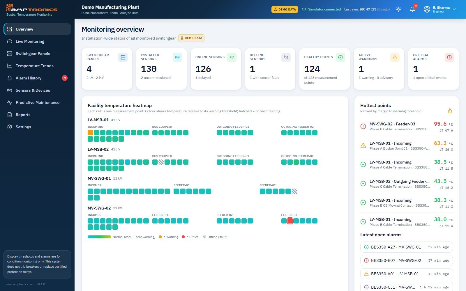
The overview shows every switchgear panel, sensor and alarm at a glance. A facility heatmap colours each measurement point by how close it is to its warning threshold, and a "hottest points" list ranks connections by their margin to warning.
- Panel, sensor, online/offline and healthy-point counts
- Facility temperature heatmap, one cell per measurement point
- Hottest points ranked by margin to warning, with ΔT above ambient
- Latest open alarms with a link to the alarm centre
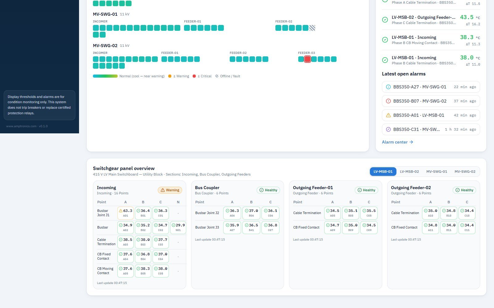
- Switchgear panel overview: every point by compartment and phase A/B/C/N
Real-time detail for every joint
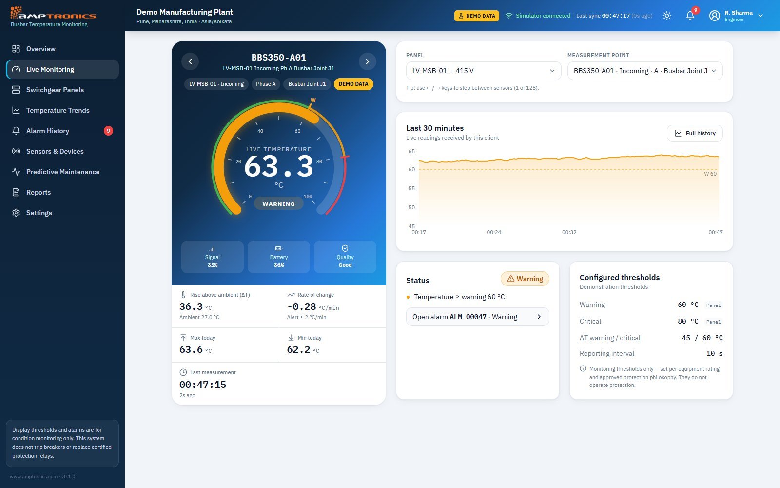
Pick any panel and measurement point to see its live temperature on a gauge with warning and critical bands, plus the last 30 minutes of readings, sensor signal, battery and data quality.
- Live gauge with warning (W) and critical (C) marks
- Rise above ambient (ΔT) and rate of change, with alert on fast rise
- Signal strength, battery level and data quality per sensor
- Configured thresholds and any open alarm on that point
Compare phases A, B and C side by side
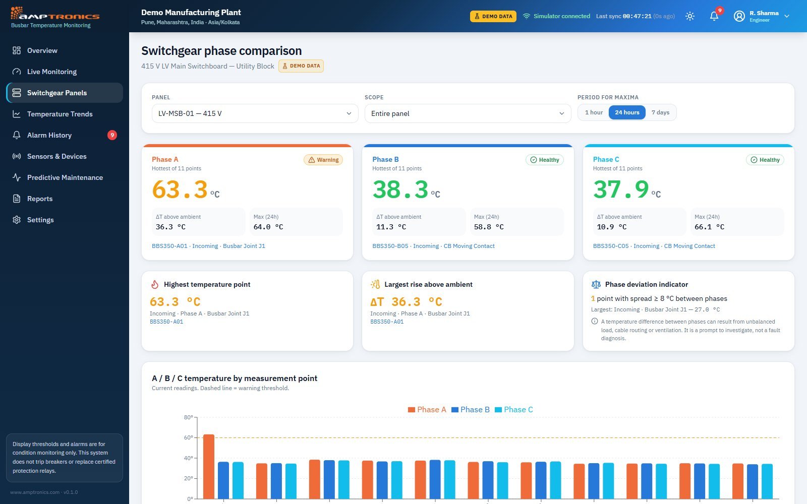
Choose a panel and compartment to compare the hottest point on each phase, with 1-hour, 24-hour or 7-day maxima. A phase deviation indicator flags points where the spread between phases is unusually large.
- Hottest point per phase with status and 24-hour maximum
- Highest temperature and largest rise above ambient
- Phase deviation indicator for spreads of 8 °C or more
- A/B/C bar chart by measurement point against the warning line
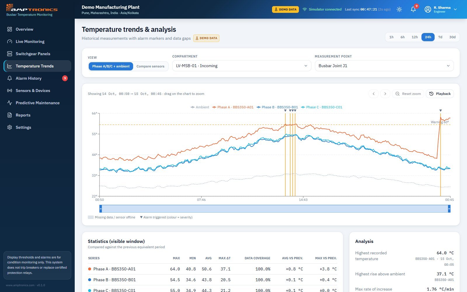
History with alarms and data gaps marked
Plot phases A, B, C and ambient for any compartment over 1 hour to 30 days, zoom into events and play them back. Alarm markers and missing-data bands show exactly what happened and when.
- 1 h, 6 h, 12 h, 24 h, 7 d and 30 d ranges with zoom and playback
- Alarm markers coloured by severity, gaps shown as sensor offline
- Statistics vs the previous period: max, min, average, max ΔT, data coverage
- Analysis: peak temperature, max rate of rise, time above warning
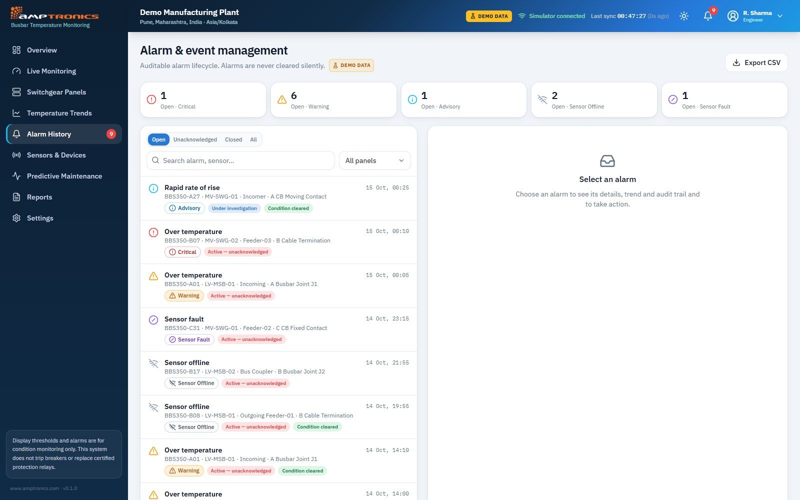
An auditable alarm lifecycle
Every alarm, whether over-temperature, rapid rise, sensor offline or sensor fault, is tracked from trigger to closure. Alarms are never cleared silently: each one must be acknowledged and investigated, and the history can be exported to CSV.
- Open alarm counts by severity: critical, warning, advisory, offline, fault
- Filter by open, unacknowledged or closed, and by panel
- Status per alarm: active, under investigation, condition cleared
- Export alarm history to CSV
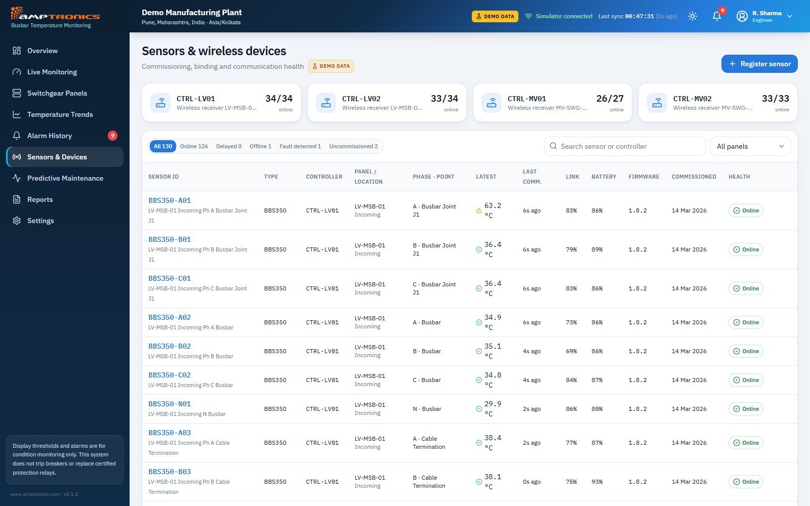
Commissioning and communication health
See every wireless receiver and sensor in the installation, which panel and phase each is mounted on, and how well it’s communicating, from link quality and battery to firmware and commissioning date.
- Receivers with online sensor counts and firmware version
- Filter sensors by online, delayed, offline, fault or uncommissioned
- Latest reading, last communication, link and battery per sensor
- Register and commission new sensors
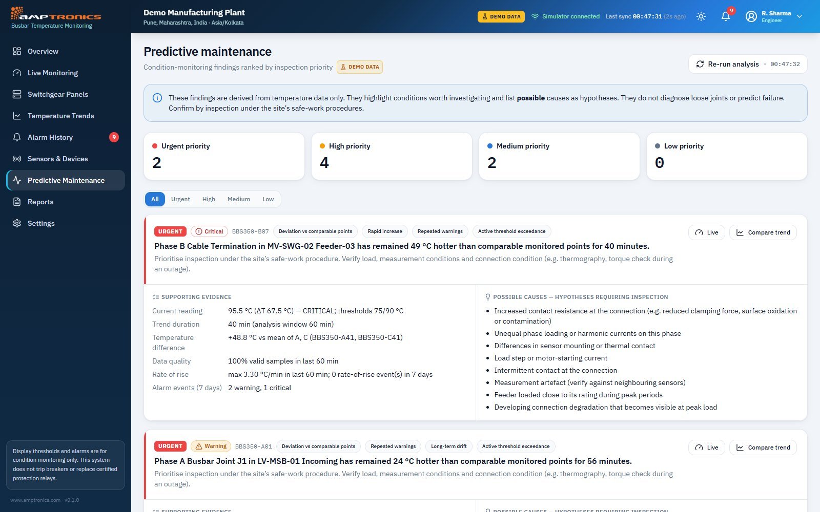
Findings ranked by inspection priority
The dashboard analyses temperature behaviour, such as deviation from comparable points, rapid increases and repeated warnings, and ranks findings as urgent, high, medium or low. Each finding lists its supporting evidence and possible causes to check during inspection.
- Findings ranked urgent / high / medium / low
- Evidence: current reading, trend duration, deviation vs other phases, rate of rise
- Possible causes listed as hypotheses to verify on site
- Recommended action under the site’s safe-work procedure
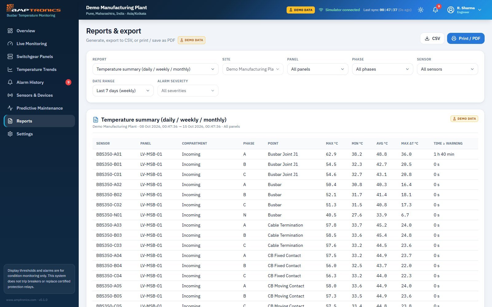
Reports for maintenance, management and audits
Generate daily, weekly or monthly reports for any site, panel, phase or sensor, then export to CSV or print and save as PDF.
- Temperature summary and maximum temperature by panel
- Temperature-rise comparison and alarm events by severity
- Sensor communication availability and maintenance activities
- Unacknowledged alarms report
One source of truth, three ways to use it
Live detail, phase comparison and ranked findings show exactly which joint to inspect and what evidence points to the problem.
The overview, heatmap and alarm centre give shift teams instant awareness of every panel and a clear process for each alarm.
Trends and scheduled reports show asset condition over time and support maintenance planning and budget decisions.
From sensor to screen
Heatmaps, trends, alarms, findings and reports for your whole site.
See your switchgear the way we do
Explore the live demo with simulated plant data, or book a walkthrough and we’ll show you how the dashboard would look for your site.
Try the live demo Book a walkthrough